Saturday, December 15, 2012

Printmaking


This was another unique assignment--for this, we would need a lino block, lino cutters, carbon paper, construction paper, tracing paper, and printmaking ink.

This assignment was something I was looking forward to. As a fan of whittling, this was something I would enjoy. Carving allowed me to kind of be with my thoughts, and this would allow us to express our thoughts, as we would be tracing the outline of an image, and then make it our own by filling in the interior with different things--I thought of it as photoshop since we would use different layers to create a final image.My original outline was that of Ray Lewis, a linebacker for the Baltimore Ravens and my all time favorite football player. But I had quite a time deciding how I would fill him in. I tried different things, most notable of which was a judo design, as Mr. Wonenberg suggested. I liked the idea, but wanted to leave it a bit and think on it some more. There was a point where I was just looking at it, and one of my friends started playing the song "Gangnam Style." Now, as much as I do not like the song, it just stuck in my head and I knew it would pop--especially since the average Korean figure is MUCH smaller than that of Ray Lewis's giant wall of muscle. I added a radial design surrounding the central image to give it that extra pop. Once that was done, I traced the image unto the lino block using the carbon paper. Cutting the block proved quite difficult for me, however, due to my image requiring quite a bit of fine details. I admit, I did press too hard while carving and carved off a little more than I needed on the figure. But the design on the background came out exactly as I wanted it to--it was a radial pattern...without really being in a particular pattern. Now for the inking process. This is where I stumbled--I was unable to get a smooth layer on my block, so many of my images came out spotty. I ended making around 20 different prints, all of them similar, but none quite exactly the same. I noticed a couple times that I would need to carve out a little more to get some finer details to show on the copy, which did work out. Despite the difficulties on this specific project, I did thoroughly enjoy it and may do it when I have some spare time.

Relief Sculpture Mask and Mixed Media


This was a complete deviation from most of what we did this semester. Our media would be clay, acrylic paint, and other mixed media we would like to incorporate on our mask. 


The mask was something that really stumped me--with little imagination and creativity, I had to awaken something in me to start on the mask. At first I started by trying to get a lion's face as my mask, but as I worked the clay, it became apparent that it was getting more difficult as I moved towards it. But as I carved off some clay for the mouth, it started to look like something more... foreign, something not of this earth. So I decided to make it an alien.... of sorts. Once it was heated I noticed that I did not like the look of its teeth, of the mouth. An image popped in my head of an alien with its mouth hidden, but I had to figure out how I would hide the mouth. After spending some time looking around at some of my things, my eyes came across one of my favorite books: The Odyssey. So I decided that, since this alien creature made an odyssey to our planet, I decided to make him Ancient Greek-like, in that I gave him quite a beard to cover his mouth, hidden, and ready to eat any human that does not agree with him. I name him, Odysseo. Who says aliens cannot grow hair?

Neutral Ground Blue Figures


With this assignment, we were introduced to a new media, a "neutral ground," grayish color as our starting point. Along with that, we used a pencil, an eraser, as well as chalk for our lightest values.

We started out by covering our sketch paper in the neutral ground. From there, we were told to look at the image in a different manner, to carve out the image with the eraser, and fill in the darker areas with our pencils. It was a little difficult at first, I was used to starting from extreme values, but it was something else to start off in the middle. So I started off with my eraser and began to create brighter values on my neutral ground, most of which were around the contour lines of the blue figures. Once that was done, I began to use the crosshatching technique to fill in the shadows of the image. Finally, chalk was used to create brighter values where needed.  

Friday, December 14, 2012

Crosshatching Seated Boy


For this assignment, all we needed was a pencil and knowledge of a new technique: crosshatching. 

We were shown a picture of a seated boy and we observed the different value changes throughout the picture--most notably, the abrupt value changes. This assignment allowed us to practice this new technique as there were numerous areas with different values, gradual value changes, and abrupt ones. We used a grid to divide the image so that it would be simpler for us to fill out the image on our larger sketch paper. I began by using contour lines to draw the boy himself, as he would be the focal point of the composition. Once the boy himself was done, I could start on the value changes. I decided to start out on the corners, further away from the boy, so that I could practice my technique, as it was the first time I used the crosshatching technique. Once I was confident with the technique, I began to focus on the values around the boy, and the values on the boy himself, as there were numerous abrupt value changes around him.

Sunday, November 4, 2012

Journal--Clay Texture


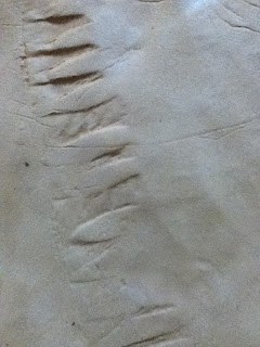
Please upload 2 images of the texture that you created while experimenting with organic and man made geometric shapes to produce patterns.

Two textures that I really like were from the bean pod and from the leaves.

As I was playing with the clay, I figured two of the most difficult things I would face were creating the teeth and texture on the lips. I found that the leaves (the camera was of poor quality) could create an excellent pattern for the lips, and that the seed pods could create the teeth patterns on my mask.

Journal 10--Cityscape


Discuss the purpose of this assignment, what techniques (illusion of space) did you use to accomplish those objectives? Discuss where and how you used those techniques...be thorough.


This assignment’s purpose was to create a cityscape view using various techniques, namely, the two-point and one-point perspective. For the two-point perspective, I must admit I was not able to completely get the hang of it, and sort of “hid” them at the sides of my city where the roads sort of diverge. From there, I started putting in buildings in the background while I thought of where to put my pyramid, before I figured I could put it in the center and set up my major-one point perspective. So, I started by putting in an arch in the front to show that one is entering the city limits, and the pyramid (or convention center) is put into the middle-front of the city—the first thing you see as you enter. The center has two fountains on both sides of its front. Buildings were overlapped to show overall density of the city, and buildings of various height are put in a “helter-skelter” formation, to show that not just the tallest buildings are hiding in the back, there are smaller buildings there as well.

Sunday, October 28, 2012

Journal 11- Gesture Drawing


      With this type of drawing, describing shape is less important than showing the action or the dynamics of the pose. Gesture drawings are not drawings of objects as much as they are of movement,weight and posture. Gesture drawing is spontaneous and created quickly. In your Journal please expound on the what you were to learn as explained in class (learning objectives) in addition write about the experience of drawing gestural figures, how did it affect your perception of the human figure. You will only have 7 days to respond to this journal. 

        Gesture drawing was a very unique experiences—most of my life I was told to pay attention to details, focusing on the finer aspects of my drawings. That is not to say gesture drawing completely abandons detail, but rather, emphasis is shown, as described, to movement, weight, posture, and proportion. Contour lines are not as defined as in other drawings. Often times, artists use this method to warm up, just as one would in sports, to get a feel for proportion, and to build muscle memory. In class, we were told that there are three phases to gesture drawing. Phase one is more or less quickly drawn “scribbles,” where the artist usually takes less than a minute to complete the drawing. Phase two starts to include contour lines to get the figure of the body, but these are free flowing and still are not very defined. Phase three, the last step, is a full definition of the figures.
       The experience was very fast paced—we were given only two minutes to complete our drawings. My first drawing (included in this journal entry), I was unable to get to the arms of the figure as I was not acclimated to such fast paced drawing, but I ended up getting it near the end of the class. Of course, I started out with a wire along the legs of the figure as taught and started to put in bubbles, which was difficult for me at first. The second drawing I was able to complete—there are minimal bubbles, but that was because the wire (the arch of the back) was so big. This assignment was great as I was able to pick up a new technique to add to my (small) repertoire or drawing techniques—I had no idea that artists had a “warm up” activity. Also, it will help me in future drawings where proportion is necessary to get the final drawing to look like the subject.


Sunday, October 14, 2012

Journal/Reflection #7 Blck Paper/white chalk


You were to have created a contour line drawing of the image-then build up the Value using white chalk so that the contour line is no longer visible. Record your thoughts...did you think about surface contour on the "Abraham Lincoln " ?? Have you increased your range of value from light to dark to more than four?

The “Abraham Lincoln” exercise was a very intriguing one. All my life, I had always thought of drawing as filling in negative space, using a pencil and filling in the white areas with darkness to create an image. It was quite a shock to me when I discovered this assignment would be a total reversal—we would be using white chalk to fill in the black spaces.

This exercise really opened my mind to the concept of negative and positive—it is never solid, rather, it varies from exercise to exercise. The contour line was simple enough—it was like drawing with paper and pencils—it was building up the value that was quite difficult for me to grasp. White is white, how can it become whiter? Although it was a struggle at first, I eventually created some varying shades of value—by erasing off some chalk and by building up layers of chalk on other portions, allowing for Lincoln’s weary, yet strong, face come through. Portions of the left half are noticeable brighter. The beard also has a different value from the skin, and we can even see the texture of the beard come through. The forehead fades from a bright value and slowly gets darker until it abruptly goes black. We can even see the light fade under Mr. Lincoln's hair at the top of his head, plus the shadow cast by his own nose.


Journal/Reflection #6 Interior (Surface) Contour Still life


 Please make an entry for the Journal/Reflection on the Interior (Surface) Contour assignment that we did in class. Explain the 3 different types of LINE and then how you used some of them in your drawing, if you did, also discuss how you used line and created the different values in your drawing, what technique (explain). 
It really works best if you write your reflection first in a word processor and then cut and paste it into the entry space.

This assignment again required us to draw ATLEAST 4 objects: the obects here are a bird, a vase, a roll of paper, and a torso. For the purposes of this exercise, we were taught about the three different lines. The first one is the actual line, a straight or curved line that can vary by thickening or darkening the line itself. An implied line, the second example, are perceived and created by the mind itself when it sees points in a composition that can be connected to form said line. Lastly, the psychic line is presented as an object pointing, or directing, our attention to another object, making our mind create a line without actually seeing a line.

The assignment was done on a neutral ground, and we were to draw first with our eraser--to carve into the neutral ground. This assignment is composed MAINLY of actual lines so as to give shape and form to the objects in the composition. However, various areas, mainly on the cloth, are composed of implied lines to give texture to the object—so that the viewer may see that the cloth is not rigid, rather, it bends and folds, it has creases! Additionally, the light cast upon the still life also creates an implied line in the shadows: when one follows the shadow from the bottom right of the vase and go towards the bottom right of the torso, they see the limit of the light exposure. As for the psychic line, there are a couple, mainly created by the bird facing a certain direction and one of the arms going off the paper. Part of the roll of paper is hidden inside the vase, but the way its drawn lets the viewer know it is still there, and they envision the rest of the roll, completing the image with those psychic lines.

We can also see that maximum exposure to light, the brightest value, is on the left side of the torso, so we know what direction the light is coming from. This brightening was done through the use of chalk so as to increase the light value from the neutral. Crosshatching techniques were done to create a darker value necessary to show shadows and create many of the implied lines on the toga on the torso.


Sunday, September 23, 2012


Please make an entry for the Jounal/Reflection on the POS/NEG Still life assignment that we did in class. Discuss the purpose of this assignment, the main concepts that were related to you during the class exercise. It really works best if you write your reflection first in a word processor and then cut and paste it into the entry space.


This exercise follows the same concept from the previous assignment, the positive/negative bird. We were to fill the negative space and leave the positive outline as is. I was absent during the class, so I used a picture one of my classmates took of the still-life (thanks, Kris!).

The still life consisted of a stool, a vase, a lamp, a frame, and what appeared to be another, smaller vase (was not too sure as it was behind a couple of things). I started out by drawing the easier shapes to outline (the outer edge of the frame) and from there, everything started to fall in place. Once the outer edges were finished, the inside edges were MUCH easier to place. It was hard to add value to different lines because we were creating a two dimensional image from a three dimensional image.

When trying to fill the negative space, I was at a loss…imagination is not my forte. As I looked at the positive image, I started to figure that it was hard to figure out what it was an image of without knowing what had been drawn as everything seemed to morph together. So I figured, why not bring in something that would not know what it is either? So I put in two extraterrestrial beings that looked confused (emphasized by the giant question mark). Their flying saucers are parked above them with two “gravitational beams” shown by using implied lines. Each flying saucer has a creature trapped inside, and they are obscured a bit by using a lighter value on their outlines.

POS/NEG Bird


Please make an entry for the Journal/Reflection on the POS/NEG Bird assignment that we did in class. Discuss the purpose of this assignment, the main concepts, (types of line, shape, value, patters....) that were related to you during the class exercise. Discuss how you demonstraited the use of Pattern, Value(dark and light), and line quality. It really works best if you write your reflection first in a word processor and then cut and paste it into the journal entry space.


For this assignment we were to draw the image of a bird and (what seemed to be) a moon, but we were not to draw the bird OR the moon. It really was confusing at first, but we were told, rather, to draw the images we saw in the negative—for example, a shark’s fin on the bottom and a breast on the right side. This taught us how to look at images with a different perspective. 

We were then to fill in the negative with whatever we chose. I was stumped at first… but the image of a bird made me think of music, so I began to fill in the negative with various musical notes. Soon after, the idea just popped into my head—“I know why the caged bird sings.” So, in front of the musical notes, but behind the moon and bird, I started to draw bars, as if caging the notes behind the bars. I then placed birds into the negative, which I left unshaded at first, but decided to shade them, putting their captivity in contrast with the freedom of the positive bird. Through the metamorphosis of the drawing, the positive bird is able to take on additional meaning, aside from the positive/negative contrast we were to draw.

I would also like to note that I chose to emphasize the images placed in the negative, so I gave their lines (and the shading) much more value than those in the positive, so that it would emphasize the emotion of being trapped in the shadows of the cage, opposed to the freedom of the positive bird.

(The orientation is wrong, even though the image is saved AND uploaded in the horizontal orientation, for some reason, blogger uploads it as vertical and there is no option to rotate it. Not sure if any one else has this problem?)

Monday, September 10, 2012

Upside down Picasso

For this first Journal/Reflection I would like you to discuss the Media used, Subject Matter, as well as the description of the assignment and Learning Objectives (what you were supposed to learn). Discuss the key terms introduced i.e.picture plane, grid, view finder...others.
Remember to upload your image of your art work from the Blogspot.com account.

This drawing was drawn drawn upside down. A study was conducted on elementary children who, when shown this drawing upside down, were able to draw an image much closer to the original than those who were shown the image right side up. The study showed that we have our own predetermined methods of drawing--if we see a human, we draw a human as we know how to. However, when the drawing is presented upside down, we draw the lines as opposed to the person.


The subject is a doctor sitting in a chair, and our objective was to copy what the artist saw on a two-dimensional plane. We used a grid in our drawing, which allowed us to divide the image into 8 equal portions, allowing our minds to set landmarks on the image so that when we copy it unto our sketch pad, which we divided into eight by folding, we have an idea of where to put it (for example, in the middle of box number 3). 

Keith Haring Drawing

Please share your reasons for the choice of imagery, color, and composition in your drawing. In addition, explain your drawings content.


In these times of hardship and corruption in our society, it is hard to find the light at the end of the tunnel here in the CNMI. The reason I chose to use only black and white is to emphasize the dark times we are in, and the only way we can get out of these dark times--through our people. The latte stone represents the CNMI, the people are, obviously, the people, and the darkness the dark times. Notice that the darkness fades as it reaches the people--that shows that we are the ones who can bring us out of these dark times. The people lifting the latte stone shows cooperation as well as strength and strength (not to mention the heavy task ahead of us), while the lines above their head represent intelligence and though, necessary for us to advance our islands.